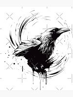
Our Groups Title Design
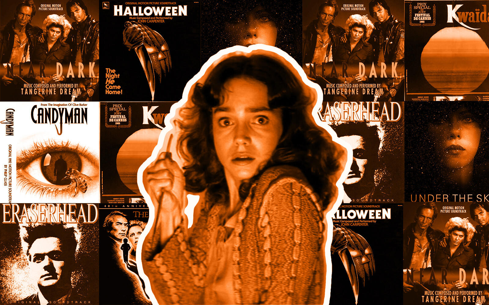
Most font ideas were taken from other opening scenes used as examples. The music and pattern of the entering texts are also related to other movie styles.
Font:My group will be using 3 kinds of fonts for our opening scene. One of them will be used for the main title of the movie. The other two will be used to display the actors and their designated jobs.
Contrast:
All of our text will be in a tint of solid white presented on a pure black background. This will help the text stick out the most and captivate their attention. During the main title, the text will be at biggest for the audience to see. During the presentation on which character is who and what, the role will be on the top in a smaller comparison in size, and the names will be below it in double the amount. This will allow us to see the role the person is taking but mostly focus on who they are.
Working Title:
The Housekeeper
Coordination:
The first texts, such as "Name of Studio", will appear before the "Name of Company." Then the title will be displayed widely in a shaky fade-in, then a glitchy outro. The roles of the actors such as "the producer" and "music by" will always be presented first, and then the names will come following in under them, they will come in from the same direction.
Timing:
We plan to make each heading come in for a solid 2 seconds or 3, depending on how long the text is, however, the main title will appear for at least 5 seconds or more.


Comments
Post a Comment